Does Your Blog Header In Top Page And Post Page Look The Same?
As you see below, this was how my blog header looks like before I write this post. There was no differece between top page(or home page, landing page) and the post page. If put into rails term, these are the #index and #show page, they’re sharing the exactly same header partial.
 alt=)
Thinking About My Target
Based on the data from Google Analytics, around 85% of the access are from search engines like Google or Yahoo, so for them the contents I provided should be most important.
But for the direct access to the top page, they could be my friends, could be the headhunters, my future boss or colleague, or just some random strangers, anyway these people are my target who I really want to pay more attentions to, make them impressive, show a little different things from the other audience.
A Good Example
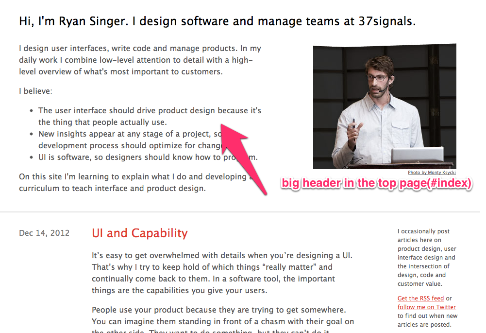
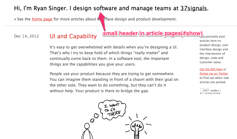
Ryan Singer from 37signals, one day I happened to visit his blog, the moment I saw the page I knew this is one thing I also want to have in my blog!
Let’s take a look.
 alt=)
 alt=)
As you can see, the header in top page and every post page is different. Yes it’s low techy techy, easy to implement, not challenging at all, but it still matters.
Time for Action!
I’m sure every web developer understand this and every product they built must have a more beatiful and well designed landing page to catch people’s eyes. But do you apply the same principle to your own blog? You may use Wordpress or Octopress or any other blog generate tools to build your blog, and perhaps you even made a good About me page, but did you take one more step further to care about this detail? If you were aware of this and chose not to do it, it’s perfectly fine but to me, I don’t like to miss this detail.
Anyway here is my new blog header, just a simple introduction, I may add some more info later.
 alt=)
I guess this post may be nonsense to some of you. But if this is one thing that represent myself, at least I’d like to put more efforts to make it a little more “me”.